I hate to love the Cheesecake Factory.
Every time I go, I promise that I’m just going to have a meal. But I always end up walking out with a piece of cheesecake.
It usually goes like this:
Server: Would you like anything else? Any cheesecake for dessert?
Me: No thanks. I’m full. Just the check, please.
Then after I’ve paid, I walk past the gorgeous showcase full of cheesecakes: red velvet (my weakness), lemon meringue, salted caramel, banana cream, and so many more.
By the time I realize I’m looking through the glass, the only question is whether I should go with my usual red velvet or try something new. And I order something to go.
But the lesson isn’t just that I have no self-control. It’s that none of us do. If we’re shown something enticing and it’s easy for us to say yes to, we almost always take a slice. And it’s not only true for delicious desserts. It works in online business, too.
Today, I’m going to show you how to use this to your advantage, and boost your landing page conversions 24% or more.
I call it the Cheesecake Factory Technique. So let’s dig in to the 3 steps you need to follow…
Step 1: A showcase that attracts attention
Cheesecake Factory doesn’t keep their 30+ varieties of cheesecakes in a backroom. They don’t package them in boxes like the frozen food section of a grocery store.
No way. They literally showcase them. They have rows and rows of different cheesecakes. And they all have exciting names: tiramisu, key lime, pumpkin pecan, and more. Whether you’re coming or going, all the different colors and flavors pull you in for a look.
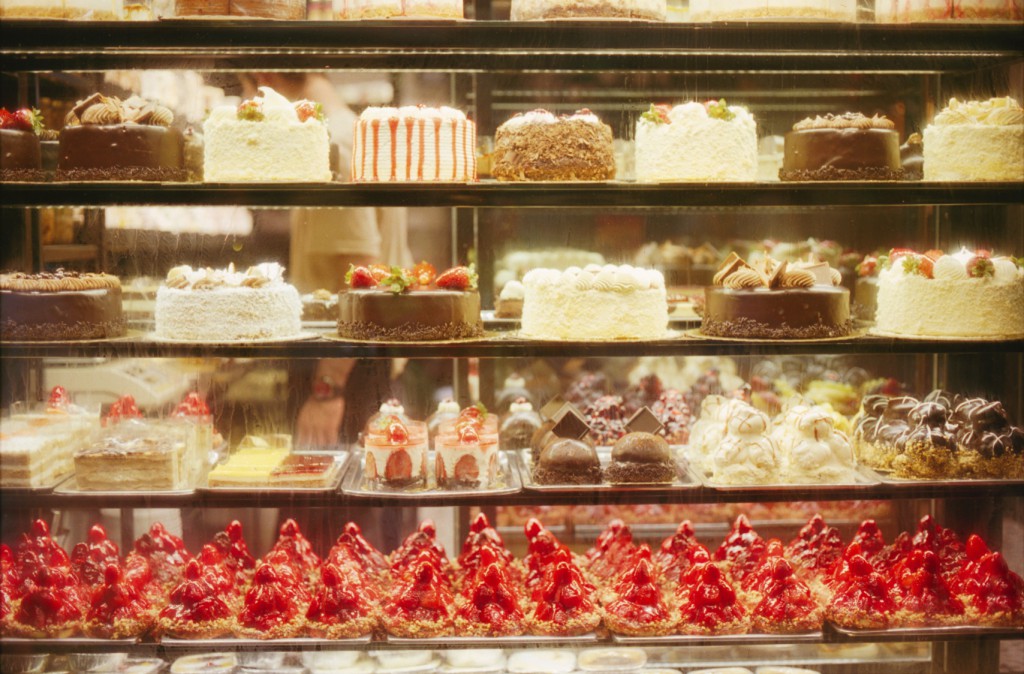
A visual display like that is more enticing than a menu or sign. People can see the cakes and imagine holding a slice their hands.
On your landing page, the headline and graphics are your showcase that people always pass by. Getting it right can grab people by their shirt collars and make them take a look.
For example, most online businesses offer a PDF carrot to entice visitors to opt in, which is okay. But making it into a picture of a book is a great way to showcase it.
That’s because a PDF is an abstract object. But a photo of a book makes it feel like something you can hold in your hand. People can’t wait to open it and flip through the pages.
Here’s an example of that from Golf Vacation Insider — a site I used to plan a golf trip to Alabama once:
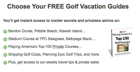
Even though this is a PDF ebook, the book cover implies a lot of work went into making it.
Here’s another great example from celebrity menswear stylist, Ashley Weston:
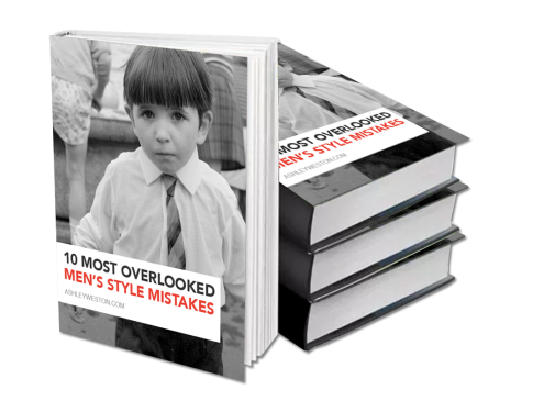
She used great design to combine the headline (report title) and her graphic. The thickness of the book hints that it’s packed with value. It’s enticing guys to opt in so they can learn the 10 most overlooked style mistakes.
Once you have people’s attention with your showcase, it’s time to make their mouths water so they’re begging you to opt in.
Step 2: Slice the cake open to show off the layers
Look at Cheesecake Factory’s display. You’ll notice some cakes are untouched and decorated. You’ll notice others are sliced open.
That’s not a mistake. They want you to imagine taking your fork and slicing through the icing, hitting the cake layer, and then crashing into the filling layer. They want you to be able to point to the specific slice you want to take home.
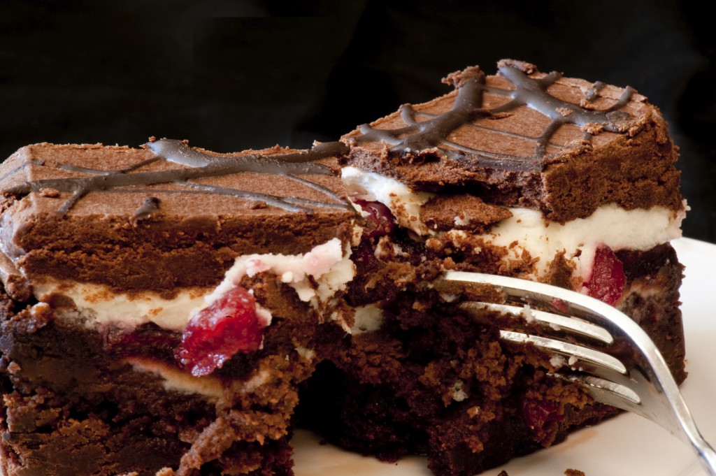
Because while a whole cheesecake can look nice by itself, it’s the small details that make people’s mouths water. And having “just one slice” is more doable for most than an entire cake.
The same is true with the carrot on your landing page. You can slice it open and show off the details to make people want it. The trick is to write great bullets that tease out just enough information to trigger curiosity.
Let me show you some real examples from IWT and why they work.
| Bullet | Why it works |
|---|---|
| Kick your junk food habit (yes, even if you LOVE it) | Kicking a junk food habit is something a lot of people want. The problem is that we love it. Especially after a stressful day. So this promise touches on something that many want, and follows it up with a common barrier. |
| Get a world-class education…cheaply | When most people hear world-class education, they think about shelling out $50,000. This bullet is a fascination. It’s making people curious by giving something expensive for a bargain. |
| Shut down bad habits with strategic “roadblocks” | When I read this, I think about browsing the web when I should be working. The idea of strategic roadblocks sounds interesting to me. It almost implies that I can still get work done, but read the websites I love when the time is right. |
| Hold onto those pivotal tidbits you learn everyday (it’s simpler than you think) | I’m an avid reader. I love learning. The problem is I can’t remember things a week later. It’s frustrating to have to go back and reference something that I knew at one point. This bullet is promising a simple solution to this complicated problem. |
These are examples you can follow to slice open your carrot for visitors. After you get a small list of them, you’ll want to put them on your landing page.
Here’s how everything looked with the IWT example:
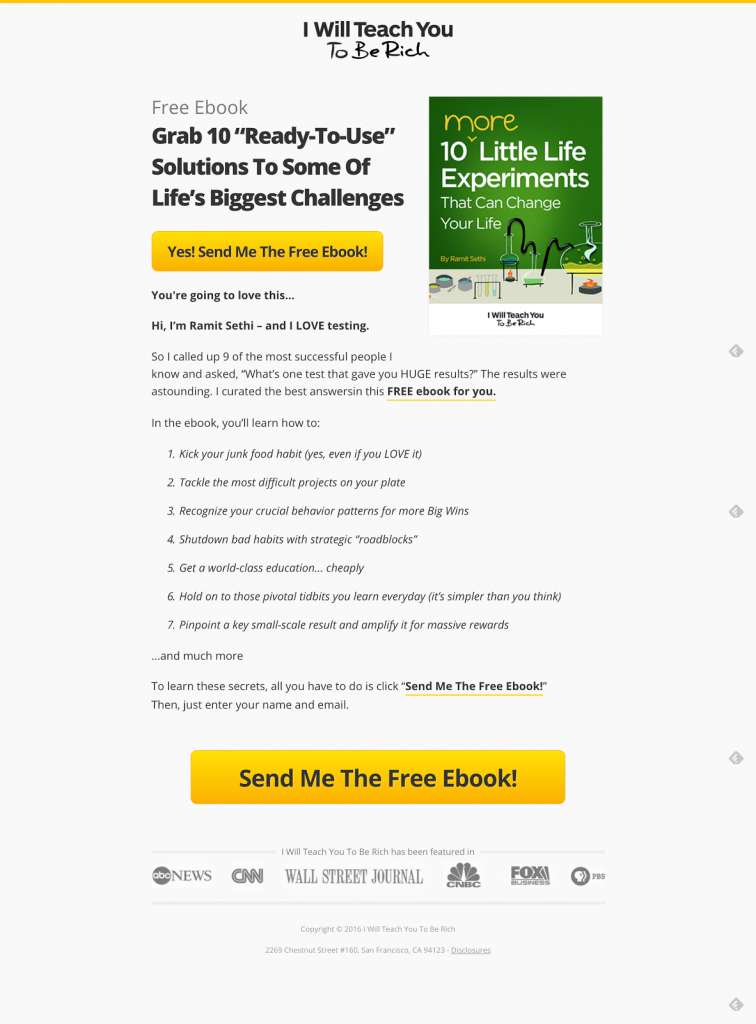
We tested this page with 7 bullets against one that didn’t have any. The bulleted-version crushed it by 24%.
The reason? One interesting tidbit can attract someone otherwise not interested. Just like an unusual cheesecake flavor can catch someone’s eye.
And PDF carrots aren’t the only thing you can slice open for people. You can do the same with recordings, videos, and podcasts to entice more people to tune in.
Srinivas Rao, over at the Unmistakable Creative podcast uses them to highlight his recent episodes. Here’s a recent one he did with Chris Guillebeau called “Finding what you were born to do”:
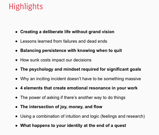
Tim Ferriss even includes the minute marks for his podcast bullets.
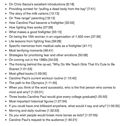
These are two popular podcasts. They go through the trouble of creating these long lists of bullet points every episode because they know how a single bullet can hook people on something they’re otherwise not interested in.
Do yourself a favor: Slice open up your carrot with some great bullets. Your opt-ins will soar.
Step 3: Make it easy to grab a slice
The Cheesecake Factory always has someone manning the dessert showcase counter. They’ll ask you if you want anything on your way out. It’s easy to point to the cheesecake you want, pay, and get on with your day.
Your landing page won’t have anyone on standby to answer visitors’ questions and encourage them to sign up. But you can still give them the final nudge and make things easy.
Nailing your opt-in copy is the way to do that.
To help you get this right, let me share an interesting test we ran at IWT. Our opt-in box told people what they would get once they signed up.
Here’s what it looked like:
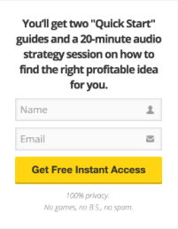
This converted at 18 percent, which is excellent. But as a company with a culture of testing, we’re always looking to improve.
Our copywriters thought the opt-in copy was dry. So we pumped it up with energy. We showed people how their lives would change once they put down their name and email for our carrot.
Here’s what we came up with:
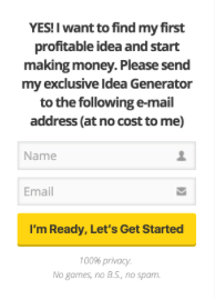
The result? The new copy lifted conversions 25%. That was a huge win for us so we rolled it out.
Based on this data, I’m going to give you a template that’ll give you a good baseline for your landing page.
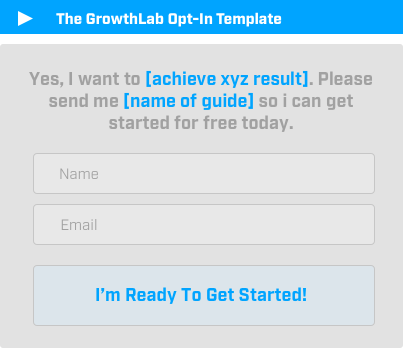
Now you know the Cheesecake Factory Technique. Use it on your landing pages and your email list will start growing.
