A good landing page serves one purpose: Converting website visitors into leads (and eventually buyers). It’s your own digital bird feeder, attracting possible customers from all over to stick around and learn more about your offering.
It sounds simple — but when done right it can turn your website into a lead-generating machine. In fact, IWT’s most popular landing page has converted almost 50,000 leads over its lifetime.
It works like this:
- Step 1: We send the page traffic.
- Step 2: Reader goes to the page.
- Step 3: We offer the reader a valuable product in exchange for their name and email.
- Step 4: Reader goes into our email funnel where they (hopefully) become buyers.
And that’s just ONE of our many landing pages. The best part? Once you have just one solid landing page done, it can produce you leads for years to come without having to touch it.
I want to show you how to do just that.
This article is going to give you a good introduction to an often confusing topic if you’re a beginner entrepreneur.
And if you’re more seasoned, you might just want to stick around. You never know when you’ll learn something new.
Landing page definition (aka why it’s so damn important)
A landing page is simply a page on your site that readers “land on” when they click on a link.
So any page on your website can technically be a landing page. However, not every page is specifically tailored to generate leads (aka email sign-ups aka the sweet, sweet life force that replenishes us all). That’s what separates a “true” landing page from every other part of your site.
Alas, the word “landing page” has become muddled over time like so many things in the online entrepreneurial world. You’re going to hear a dozen different landing page definitions and different words for landing pages like splash page, squeeze page, whatever.
When you distill all great landing pages down, though, you’ll find that they all share one thing in common:
A call to action
If a landing page’s goal is to turn visitors into leads, the call to action is the sign pointing them in the right direction.
Though call to actions can get readers to comment or email you back, they’re also used to get leads. So when you see a call to action directing the reader to sign up for something, you can bet that you’re on a landing page.
What makes for a good landing page?
Welcome to Landing Page Anatomy 101. I’m Professor Tran, but you can just call me Tony.
(sits in chair backwards)
Before you start standing on your desks shouting “O captain! My captain!” it’s time for a pop quiz: What things are included in a good landing page?
Is it good copy?
A stellar call to action?
Cute puppy GIFs to get your reader to click through?

There are four core elements that go into a winning landing page:
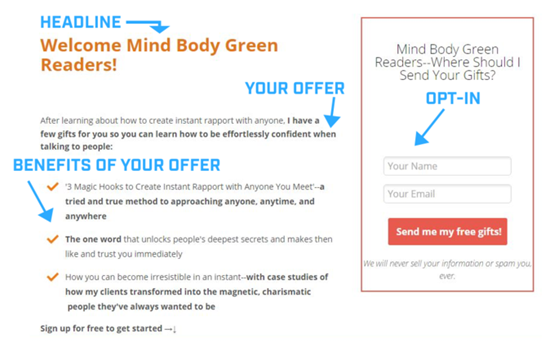
- Headline
- Offer
- Benefits (or what they’ll learn)
- Sign-up/opt-in
Let’s take a look at this simple landing page now and break down the elements in it that make it work.
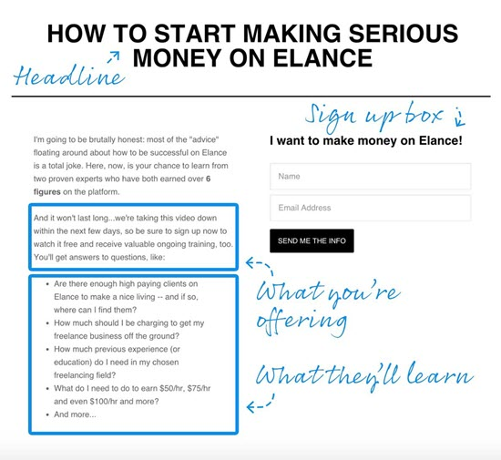
It’s simple. It’s straightforward. And most importantly, it works (more on that below).
Let’s find out why by breaking down each of the four winning elements involved. Be sure to take notes. You WILL be quizzed during this lecture.
Want to build a business that enables you to live YOUR Rich Life? Get my FREE guide on finding your first profitable idea.
Element #1: Headline

Like any good blog post, YouTube video, or newspaper article, a compelling headline can mean the difference between your page gaining hundreds of leads a month OR gathering dust in the dark forgotten reaches of the internet where the Numa Numa guy lives.
Upworthy founder Peter Koechley once stressed the importance of good headlines to his company’s strategy:
“The difference between a good headline and a bad headline can be just massive,” he said. “It’s not a rounding error. When we test headlines we see 20% difference, 50% difference, 500% difference. A really excellent headline can make something go viral.”
We’ve written about how GL crafts compelling headlines before. So to help you out, here are 10 great headline formulas we’ve used in our articles that you can STEAL for your landing pages.
- Ask a question: “What would you tell your younger self?”
- Give a command: “Go where the fish are”
- Use a “how to” headline: “How to drive traffic to your website”
- Tell a story: “The fast, cheap way I started my online business”
- Make a list: “The 100 things you need to know to start a business”
- Announce news that’s novel and relevant to the reader: “New free guide: Launch your online business”
- Make the headline time sensitive or urgent: “I’ve never done a contest like this”
- Be direct and address a pain: “So you have skills. How do you get paid for them?”
- Give the reader useful information: “My checklist for finding a profitable business idea”
- Create mystery: “Are we being manipulated?”
POP QUIZ #1: Which headline formula did Danny use in his copy?
If you answered “‘How to’ headline” you’d be correct!
But that’s not all that Danny does well in his landing page.
Element #2: Offer

It’s the Golden Rule of content: Always add value.
People always want something in return. If you don’t have anything to offer, they’re not going to give their information to you.
Danny offered amazing value by showing viewers how they can make money through Elance. He then gave the reader a sense of urgency by writing that it’s going to be for a limited time only. Awesome.
So ask yourself, “What can I offer my readers for my landing page?”
Your offer can come in the form of an information product such as an e-book, an ultimate guide, a video, or other tools.
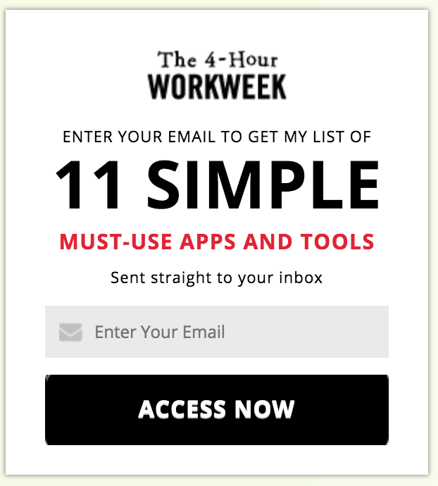
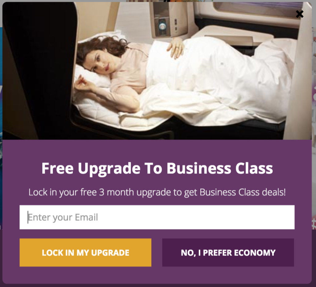
But I get it: You might be a completely new entrepreneur who doesn’t think they have a flashy product to offer yet … but you actually do: Your newsletter. As long as you’re selling your reader on the benefits of your newsletter, they’ll opt in.
Which brings us to…
Element #3: Benefits (What they’ll learn)
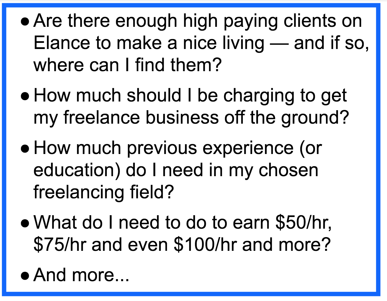
So you have your offer … but why should I care? What is your e-book/mini-course/podcast going to do for ME?
This is when you show them the benefits of giving their name and email address to you.
As the old marketing maxim goes:
“Buyers don’t want a new bed. Buyers want a good night’s sleep.”
This is the key difference between selling a feature and selling a benefit.
POP QUIZ #2: What’s wrong with the following benefit?
“My course is a three-month fitness program.”
Answer: That’s just a feature. No one cares if you have a three-month fitness course. What they care about is what your offer will do for them.
Instead, if you said, “My course will give you washboard abs in just three months!” then you’ve painted a picture. Your offer pops off the page, grabs the reader by the lapels, and says, “Sign up now! Beach season is three months away!!!”
Here are some other examples of features versus benefits:
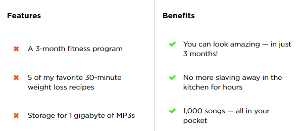
In the end, remember to show don’t tell. Give the readers a picture of what will happen when they get your offer. Doing so will have them clamoring to sign up for your list.
Speaking of which…
Element #4: Sign-up/opt-in
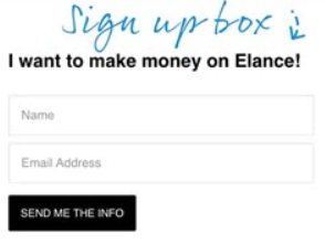
The opt-in area is possibly the most crucial part of your landing page. How else are you going to generate leads?

There are a few best practices to keep in mind when constructing your opt-in form:
- Keep it simple. You only need a little info from your reader to turn them into a lead. Don’t run the mistake of asking for first and last name, email address, home address, phone number, date of birth, social security, most embarrassing moment in middle school, and body fat percentage. Just the first name and email address will do (like Danny).
- Keep it visible. Your opt-in form should be one of the first things you see on your landing page. Don’t make the mistake of burying it under a mountain of text (unless you’re providing value that entire time). The specific placement of the form doesn’t matter as much as being able to see it.
- Keep it clear. Be playful when it comes to the header and button copy. Swapping out the word “submit” for something more engaging on your button can actually increase your conversion by 25% – 30%. Notice how Danny (from FreelanceToWin) does it. He chose to take the position of the reader with his copy, resulting in a more fun and engaging opt-in form.
You’re going to discover that you can break these rules as you go along in your entrepreneurial journey. For now, they’re good tips to keep in mind when creating your opt-in form.
Tools of the craft
You don’t have to be a programming wizard to create a landing page or opt-in form. There are plenty of platforms available for entrepreneurs to start gathering leads today.
We’ve included a great list of these tools below. Most of these services have a monthly pricing plan — but you’ll also be able to leverage their free trials so you can get a feel for each.
- Leadpages. This incredibly popular service is the same platform Danny used to create the simple but effective landing page above. Very intuitive and easy to use.
- Instapage. A very powerful platform to create landing pages. Also easy to use with its drag-and-drop page customization.
- MailChimp. Though they’re more known for their email newsletter services, MailChimp recently unrolled a landing pages platform. This is the cheapest option on the list.
- Unbounce. This is a more nuanced platform, but powerful if you want to get into the weeds with your landing pages.
In the beginning, you don’t need that many landing pages. One to five landing pages should be good as you’re still finding your first leads.
However, as your company grows, so will the amount of landing pages you need. HubSpot looked into how landing pages affect lead generation. They found businesses see a 55% spike in lead generation when they have 10+ landing pages.
For now, just choose one and play around with it. The important thing is just having a solid landing page finished.
What now?
So you’ve built your landing page using the tools and anatomy guidelines outlined above.
Congrats! You have your very first landing page.
From here, landing pages can be used in a number of ways, including affiliate marketing and even event sign-ups.
However, many entrepreneurs leverage landing pages in pay-per-click ads on sites like Facebook, Google, Twitter, or YouTube. After buying an ad via Google Adwords, Facebook Ads, or whatever, you link the ad to send readers straight to your landing page.
That’s what Danny did for his page when he bought out this Facebook Ad:
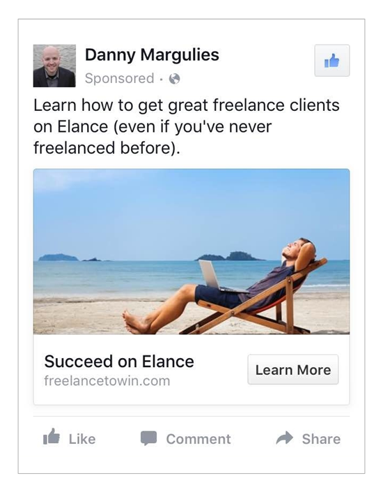
It’s a small unassuming ad — but was it effective?
POP QUIZ #3: How many subscribers do you think he got within a week?
One or three?
A dozen?
Danny got 100 subscribers in one week with 10 converting into paying customers.
And it all started with this simple landing page.

But you shouldn’t stop at your landing page — which is why we want to offer you something that will 10x your marketing strategy:
The Ultimate Guide to Digital Marketing
Our founder, Ramit Sethi, spent over a decade using digital marketing to grow IWillTeachYouToBeRich.com to over one million readers per month. He used proven systems to get there.
In this ultimate guide, Ramit will show you the same systems:
- Who are the digital marketing experts he’s studied (and you should, too)
- What are the exact digital marketing strategies he’s used to grow his blog to a million readers per month
- Why you can’t ignore these tools — even if you write amazing material, if nobody knows about it, it’s worthless
- When to use each of these digital marketing strategies (Hint: some of them may not be for you right now, and that’s good!)
- How to start using them today for free or with minimal investment.
Want to build a business that enables you to live YOUR Rich Life? Get my FREE guide on finding your first profitable idea.
